Alex & Ani (UX/Research)
ALEX AND ANI designs and creates bangle bracelets, necklaces, earrings and rings that adorn the body, enlighten the mind, and empower the spirit.

The Challenge
The task was to create a more personalized experience for Alex n Ani’s customers, in both product selection and the mobile website experience.
My role - Ideation, Market Analysis, User Research, User Flows, User Testing, Mid-fi Mockups, and Prototyping
Individual Project
Tools - Axure, Sketch, InVision, Pen & Paper
Duration - 12 days

Define the problem
My approach was to first analyze what the company already delivers then find what they might need, product wise, to stay competitive.
What the current website is good at —
Suggesting unfamiliar products —“Wear it with” at the bottom of every product page
Getting help instantly —Mobile Chat box
Distinct product categories —Extensive side menu options
What are competitors are doing —
Offer options outside of Jewelry such as decor
Have a personalized product line
Minimal choices with clear layout

On the current mobile website, the “trending now” tab is prioritized to showcase newest collections as well as bestsellers. Although they are helpful, these collections are often base on an event or character, some of which customers may not find relevancy to at the time of interest.
Therefore, I considered creating a new permanent product line that allows flexibility and personalization. This product line would allow users who are not interested in the current trends to produce their own personalized jewelry and home decor.

Empathize with users
Quotes":
“I’m not sure which symbols/styles would work well together”
“I prefer not to wear jewelry but enjoy the meaning of the symbols”
“I like that the Chat function, makes it easy to ask questions”
“Does the quality match the prices of the products?”
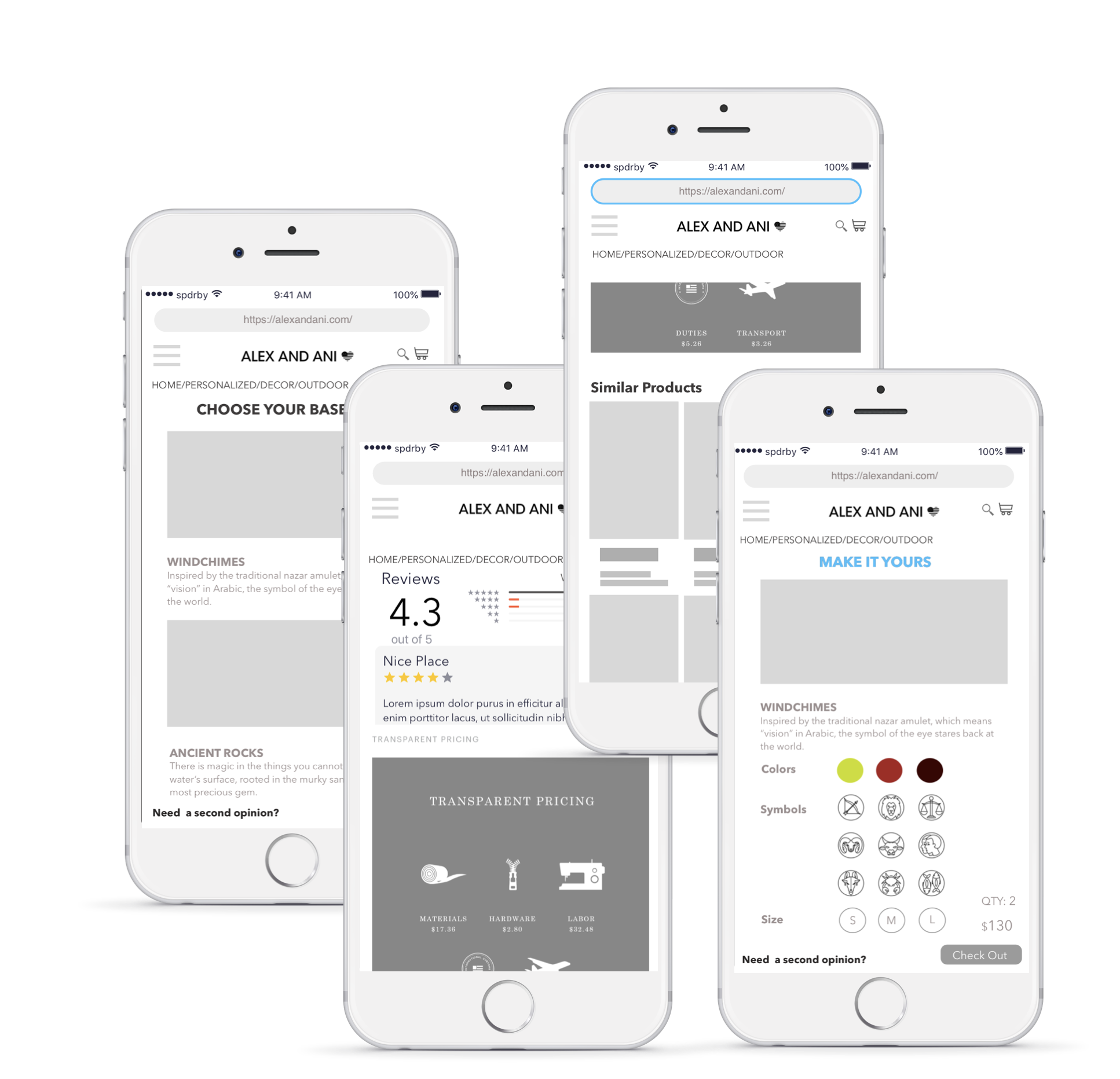
Through six user interviews, I realized that many often choose not to make a purchase due pricing. They were curious whether the quality of the product is really what it is advertised.
To help users better rationalize the pricing of our products, I proposed adding pricing transparency, such as material cost, labor, duties and transport to each product listing on the website. This way users can easily view the costs and value of our product (made in America!) before making the decision to purchase.


Information Architecture
I created a site map of the mobile site to aid with the addition of the new product line on the side menu. There were two options. One was to add this new line under the “Trending Now” main header as a sub header. Two was to add it as its own header. After observing users navigate through these options, I saw that users understood the meaning of the product line as permanent better under its own header.
With the personalized line as a main header, we divided it into two sub headers, Jewelry and Decor. Under Jewelry, there will be additional options such as rings, charms etc. Decor will be spilt between indoor and outdoor products.

The flow shows how a user can start with browsing a product, to personalizing the product (with their name/symbols), and checking out.

The Solution

Mid-fi Mockups

Redesigned homepage
Home page was redesigned to better engage users while minimizing the main menu options.

Product Browsing
The personalized page has limited choices in products but allows users to customize from over 10 options in colors, symbols, and size. The product page also shows pricing transparency information as research showed that users are interested in the social impact of their shopping decisions. On top of that, the similar product images are larger for a better view.

Users can also benefit from suggestions for matching pieces from their previous personalized jewelry selection.

Additional options for shipping and gift wrap are added to help built a holistic experience for users.

Next Steps
Wireframes —
More variety of pictures per product
Too many suggestions in “Wear it with”
Product composition info is missing
Prototype —
Add Option to change quantity at check out
Option to sign up at check out
Indoor vs Outdoor items are unclear
